Custom theme case study


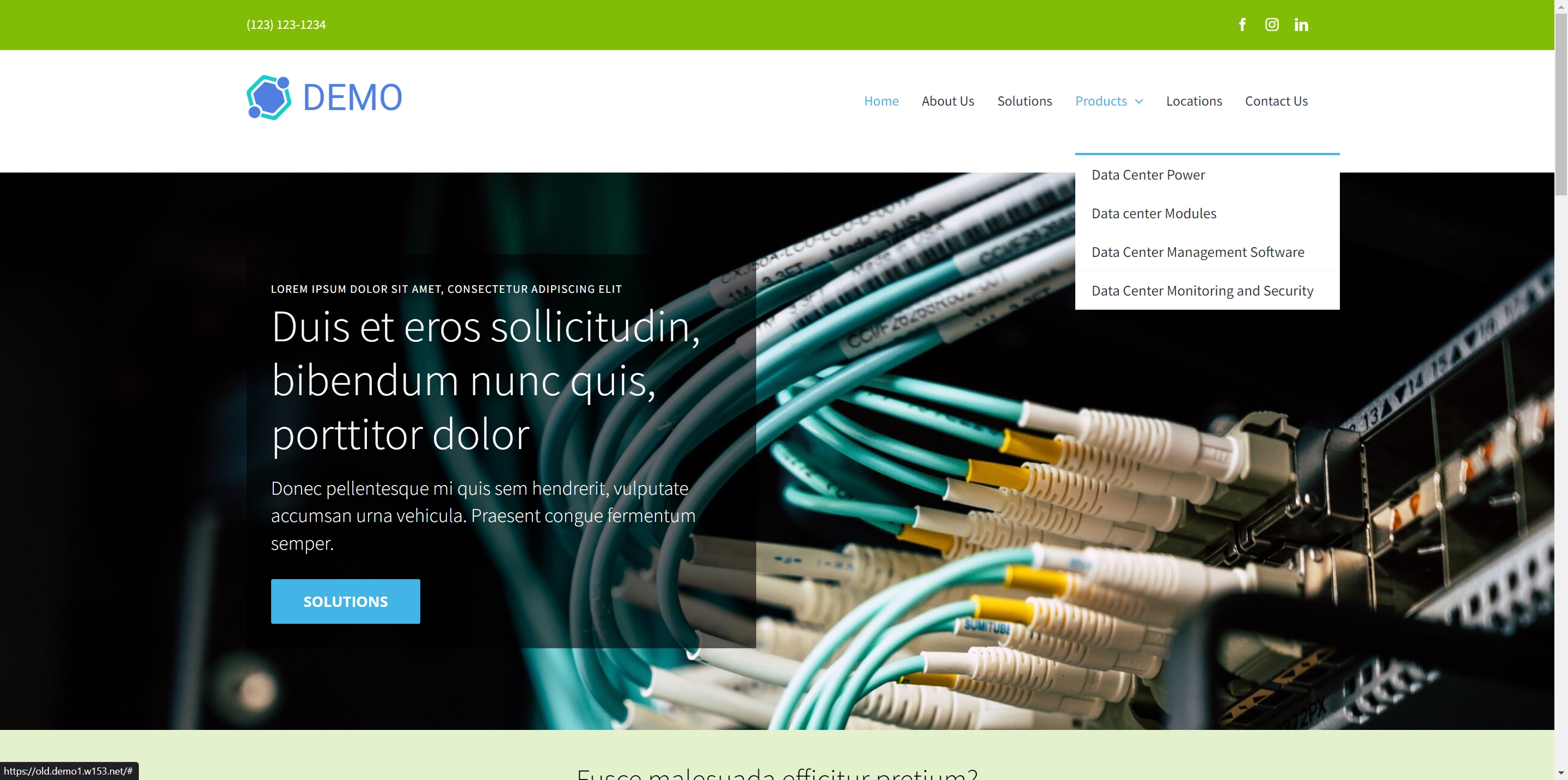
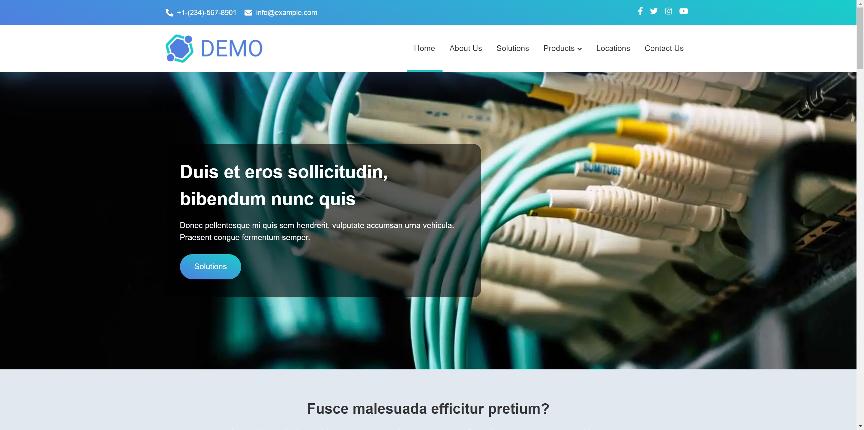
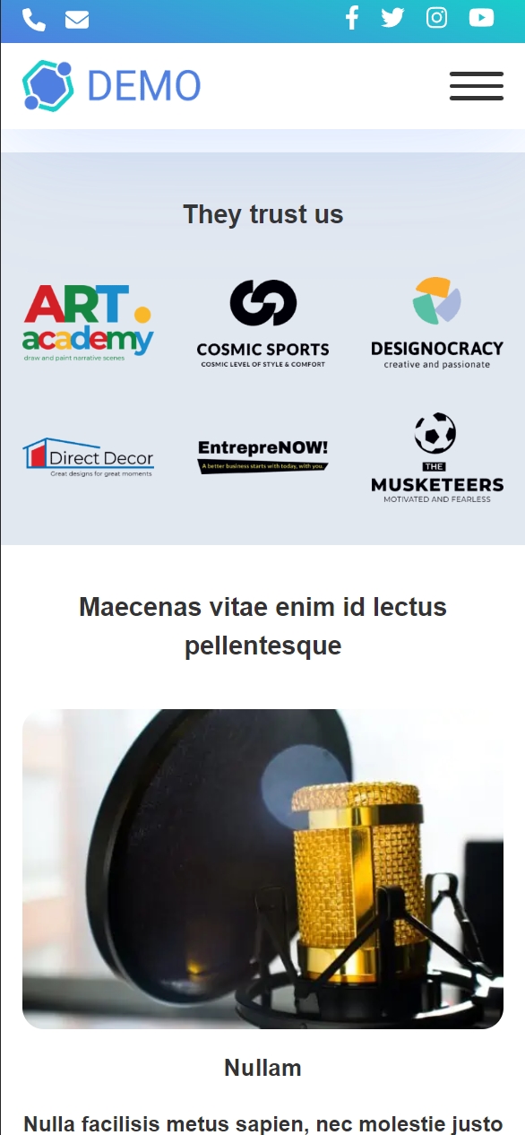
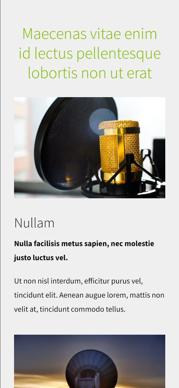
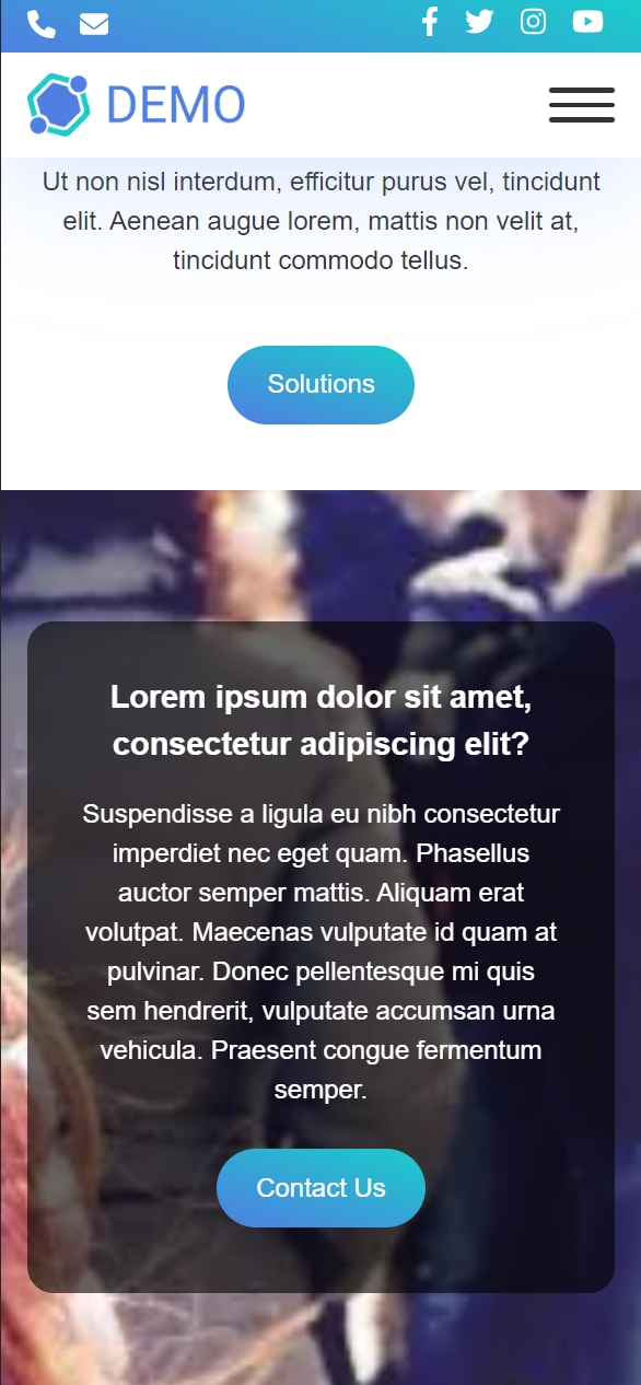
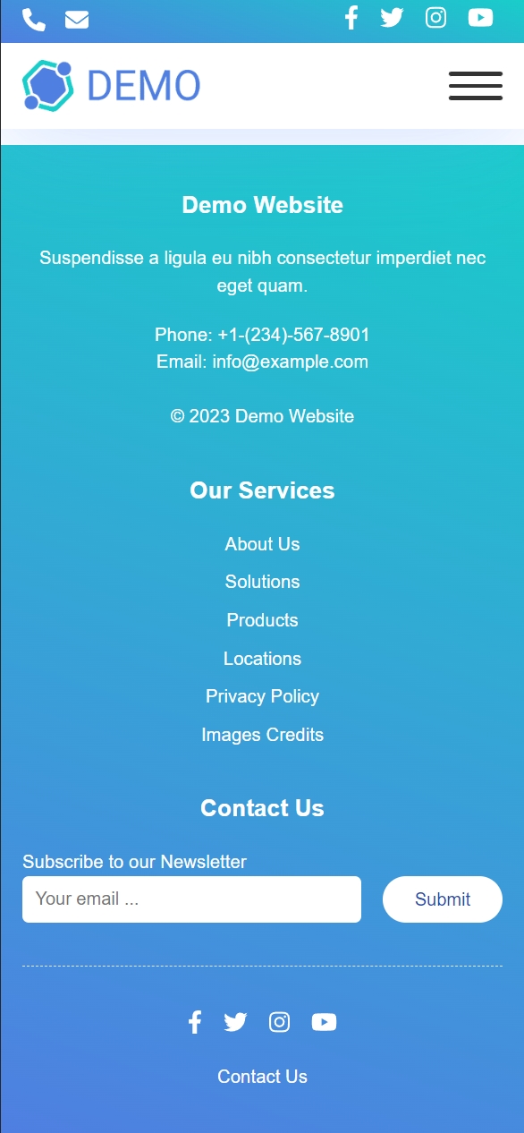
In the comparison table below, you can observe each theme element as Google looks at it, and read about what our web development experts have done to optimize it and how our optimizations contributed to the site's overall score and technical SEO. The old site was built using a demo of a popular commercial theme from ThemeForest. 

*This client's old and new sites were cloned for this case study presentation, and the text was replaced to protect the client's identity.

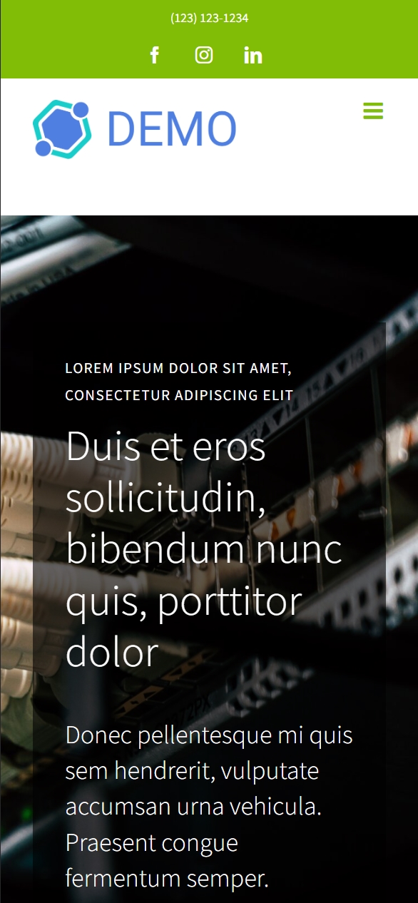
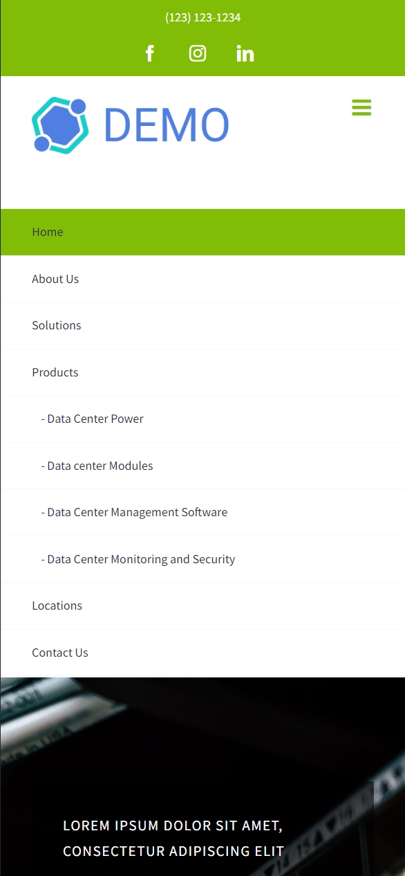
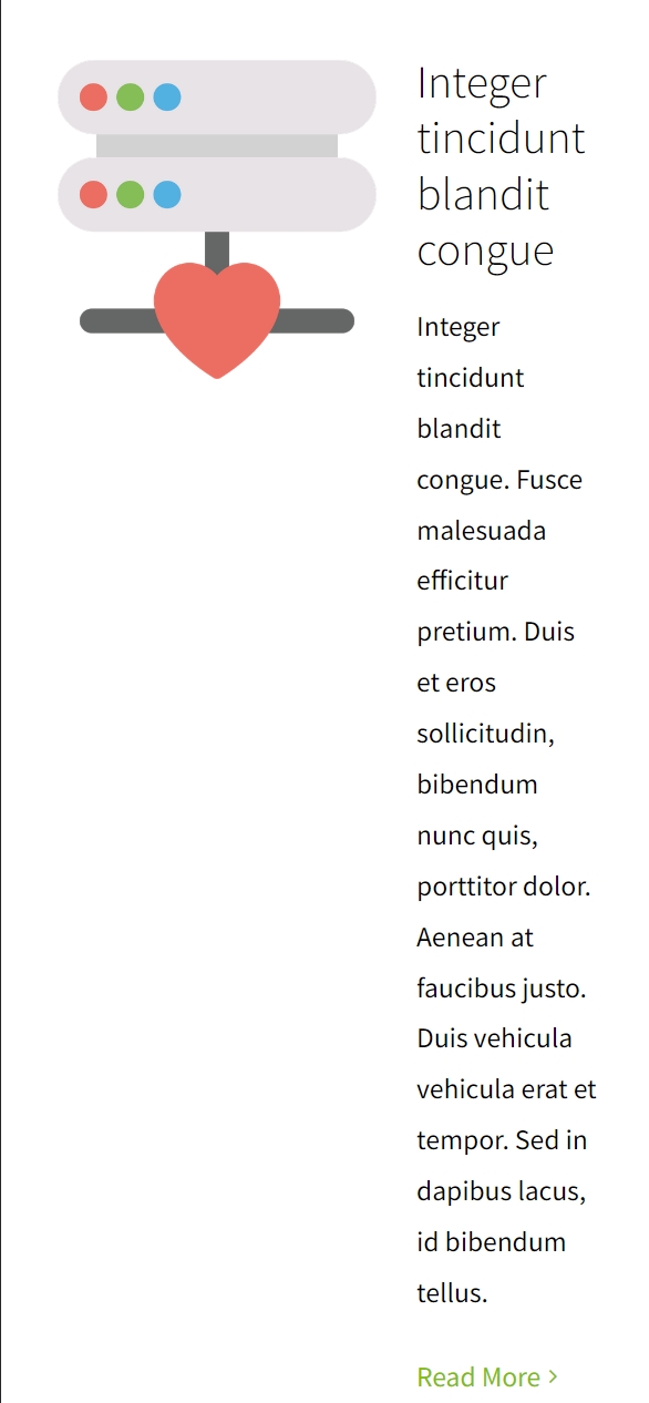
Old Website

old.demo1.w153.net

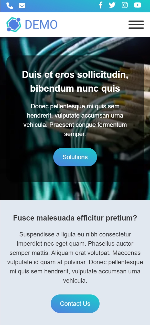
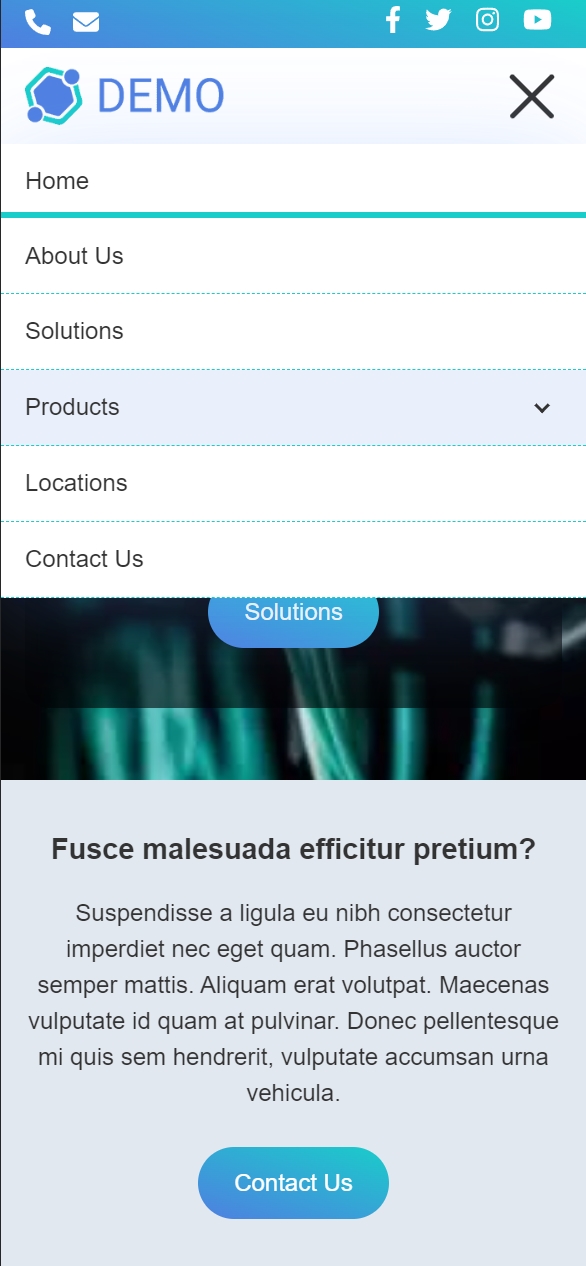
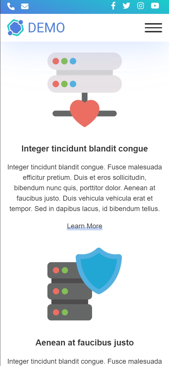
New Website

new.demo1.w153.net

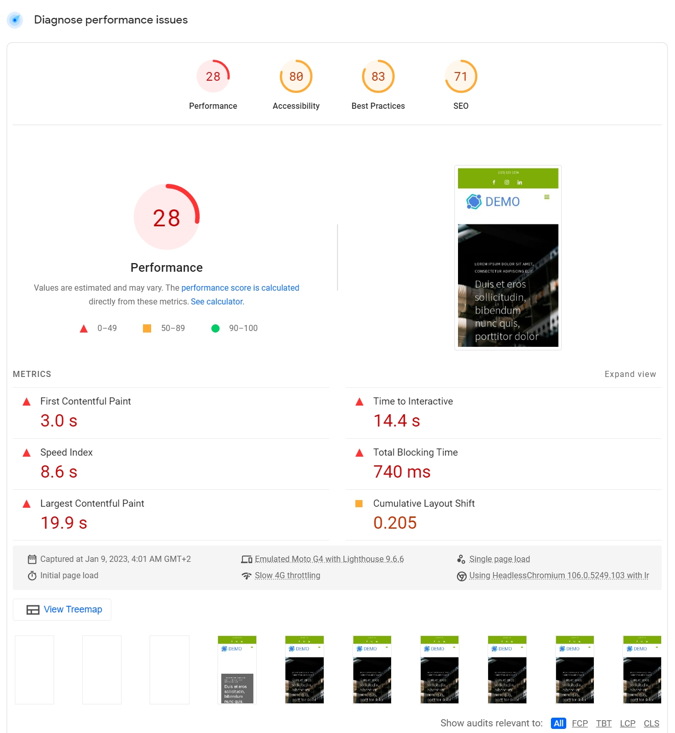
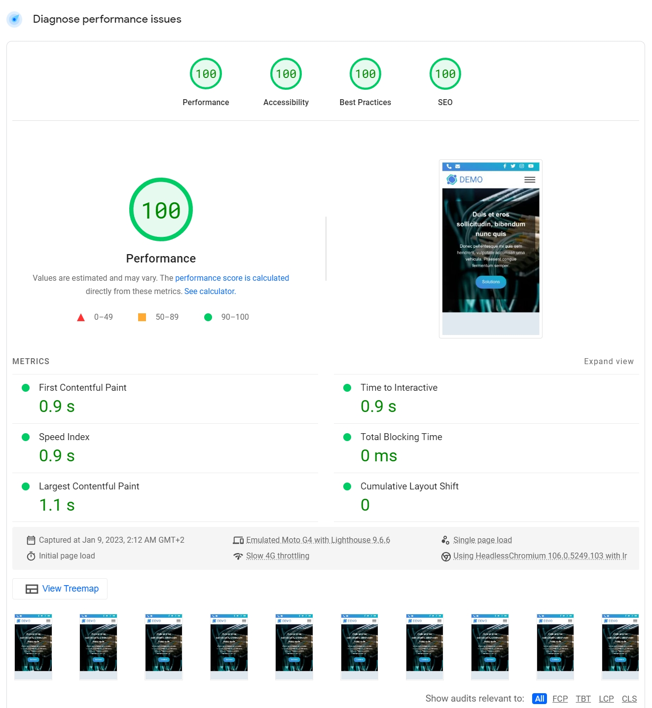
PageSpeed Insights

Overall Score Mobile / Desktop
28 / 73 100 / 100
Accessibility / Best Practices / SEO
Not Optimal Fully Optimized
Core Web Vitals
Not Optimal Fully Optimized

Let's talk numbers

According to gtmetrix.com, lower is better
Fully Loaded Time
4.5 sec. 0.96 sec.
Total Page Requests
106 15
HTML Page Size
158 KB 10.3 KB
Total CSS
73.7 KB 1.66 KB
Total JS
579 KB 1.68 KB

UX Improvements

Mobile-First Design.
Built-in Critical-CSS.
Component-based structure.
Custom, optimized Page Builder.
Improved structure and accents following Brand colors.
Consistent spacing.
Sticky header.
Discreet, pure CSS animations.
Pure CSS Parallax elements.
On-demand interactive elements: Sliders, Carousels, Lightboxes
Automatic Images optimization, WEBP conversion

Mobile UX Improvements

Improved mobile structure and design.
Consistent spacing.
Sticky header.
Animations enabled on mobile, including parallax elements.


We eliminate unnecessary code and files and equip you with the tools to run lean in the future by eliminating plugins, and manually writing the code for the things you need.
This can be done for every site

WordPress, Shopify, Woocommerce, or Magento